Design Guidelines
Welcome to beep's brand guidelines. This guide helps you use our brand consistently and effectively – from logo and language to the right materials for marketing and communication.
The name "beep", the beep logo, the beep brand and all other trademarks of beep labs are intellectual property of beep labs. These guidelines serve to provide our partners, resellers, customers, developers, consultants, publishers and other third parties with clear guidelines on how our trademarks and copyrighted content may be correctly used and presented in their own materials and media.Logo
Wordmark
Our wordmark embodies the essence of our visual philosophy. The name beep derives from the familiar sound that is heard when paying with a card or smartphone – or from the rhythmic signal of a clock that makes a "beep" every second. This connects our brand with payment and time – two central elements of our concept.
The size of the wordmark can be flexibly adjusted, but its balance and proportions remain firmly defined. This ensures a consistent appearance across all products, services and departments. Depending on the context and brand awareness, the wordmark can be used in different variants – suitable for region, medium or time.
Typography
Beep combines geometric precision and functional clarity with an accessible, human character. Fine details – such as softer curves and individually designed letterforms – give the typography a friendly, harmonious and at the same time technically precise appearance.
The brand name beep is generally written in lowercase to convey simplicity, accessibility and modernity. It may only be capitalized at the beginning of a sentence or in typographically conditional exceptions (e.g. in headings in uppercase).
The font family is available in five basic weights: Light, Regular, Medium, Semibold and Bold – each supplemented by a matching italic style. Beep also has precise alignment and glyph refinements that ensure optimal readability and versatility in both digital and print applications. Modern OpenType features such as ligatures, tabular figures and context-dependent punctuation provide additional flexibility for professional use.
The font was developed to embody the brand ethos of beep: a balance between technological precision and human warmth. It conveys a forward-looking and inclusive tone and reflects beep's mission – to use technology in the service of all humanity.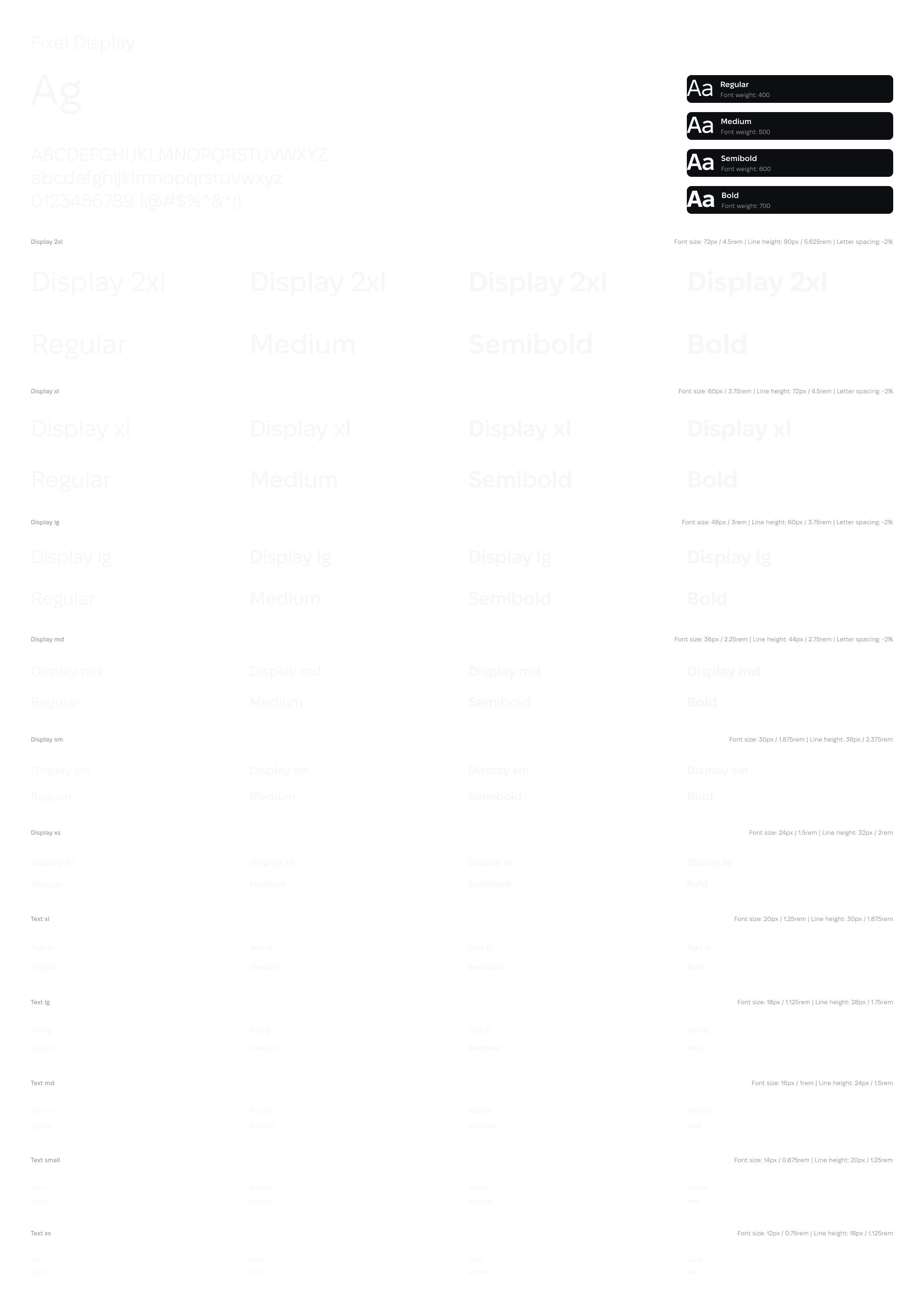
Colors
Beep's color palette was developed to visually embody the brand ethos – a balance between technological clarity and human warmth. The saturated sky blue stands for openness, trust and digital precision. The noble dark gold symbolizes value, permanence and respectful handling of time and data. White creates space, balance and transparency – the basis for clarity in communication and design.
Together, these colors convey a forward-looking and inclusive character and reflect beep's mission: to bring technology and humanity into harmony to serve the entire community.
